
Shortcodes
This Wordpress theme "Kalvi - LMS | Learning Management System" comes with several shortcodes that helps in customizing your content easier.
1Timeline
Timeline Shortcode lets you create an elegant and animated timeline in both vertical and horizontal looks on your website. It helps you to populate your website with great announcements and notifications. Notably, you can set the timeline express with date and time in proper sequential order.
[vc_row full_width="stretch_row"][vc_column][dt_sc_horizontal_timeline column="2"][dt_sc_hr_timeline_entry title="JAN 2015"]Lorem ipsum dolor sit amet, consectetur adipiscing elit. Morbi hendrerit elit turpis, a porttitor tellus sollicitudin at. Class aptent taciti sociosqu ad litora torquent per conubia nostra.

[/dt_sc_hr_timeline_entry][dt_sc_hr_timeline_entry title="FEB 2015"]Lorem ipsum dolor sit amet, consectetur adipiscing elit. Morbi hendrerit elit turpis, a porttitor tellus sollicitudin at. Class aptent taciti sociosqu ad litora torquent per conubia nostra.

[/dt_sc_hr_timeline_entry][dt_sc_hr_timeline_entry title="MAR 2015" class="bottom"]Lorem ipsum dolor sit amet, consectetur adipiscing elit. Morbi hendrerit elit turpis, a porttitor tellus sollicitudin at. Class aptent taciti sociosqu ad litora torquent per conubia nostra.

[/dt_sc_hr_timeline_entry][dt_sc_hr_timeline_entry title="APR 2015" class="bottom"]Lorem ipsum dolor sit amet, consectetur adipiscing elit. Morbi hendrerit elit turpis, a porttitor tellus sollicitudin at. Class aptent taciti sociosqu ad litora torquent per conubia nostra.

[/dt_sc_hr_timeline_entry][/dt_sc_horizontal_timeline][/vc_column][/vc_row]
1.1Horizontal Timeline
Available Parameters
type - The available options are type1 and type2. This option let you display your timeline in two variant attractive looks.
column - The available options are 2, 3, and 4 columns. This option lets you set the number of grid columns for the timeline.
class - Using this option you can add a custom class to the wrapping HTML element and do furthermore CSS customization on the element.
1.1Vertical Timeline
Available Parameters
type - The available options are type1,type2,type3,type4,type5,andtype6. This option let you display your timeline in two variant attractive looks.
class - Using this option you can add a custom class to the wrapping HTML element and do furthermore CSS customization on the element.
1.2Timeline Entry
Timeline entry allows you to add content on the timeline.
Available Parameters
title - This option let you add text that will be shown as the title of the timeline post..
image - This option let you add an image for the timeline post. This option is only available in horizontal timeline.
icon type - The available options are font awesome, icon class and image. By selecting anyone from above options and you can set the icon for the timeline post. By choosing the font awesome option you can select the icon directly from the prebuilt icon library. If you choose the icon class option, you can add the icon by adding icon class name. If you choose the image option, you can directly add the image icon from your media library. As well, you can also add image hover text by using image hover text option.
Note: The image icon adding option only available in vertical timeline option.
subtitle - This option let you add text that will be shown as the subtitle in the timeline post.
content - The content option lets you add contents in a stylish look that are integrated with wonderful links.
class - Using this option you can add a custom class to the wrapping HTML element and do furthermore CSS customization on the element.
Horizontal Timeline Output

Vertical Timeline Output

2Simple Heading
When you writing text or sentence in a website page, sometimes you may want to call out a piece of text as a quotation. Our blockquote shortcode will help you to define long quotations on your website page in multiple colors with a gorgeous look.
[vc_row][vc_column][dt_sc_simple_heading type="two-color" text="Heading & Title Tags" class="dt-sc-kalvi-default-title no-decor"]Lorem ipsum dolor sit amet, consectetur adipiscing elit. Morbi[/dt_sc_simple_heading][/vc_column][/vc_row]
Available Parameters
type - The available heading options are simple, two-color,two-border, two-border-with-subtitle, with-icon-link, ribbon, script, stripe, mz-stripe, split, decoration, triangle, type-writing, and title-with-image. This option let you display the title in variant attractive looks.
tag - The available heading options h1, h2, h3, h4, h5, and h6. The option let you set the size for your title.
text - The text option lets you add the text for the title.
class - Using this option you can add a custom class to the wrapping HTML element and do furthermore CSS customization on the element.
subtext - The text option lets you add the text for the subtitle. This option only available at two border with subtitle, script, stripe, type writing, and with image.
link - The URL option lets you add a link and title caption for the title. This option only available at icon with link.
icon_class - This option let you add the icon that you want to show on the title by adding the custom class on the icon class box. This option only available at icon with link.
content - The content option lets you add contents in a stylish look that are integrated with wonderful links. This option only available at
image - The image option lets you add the image on your title. This option only available at with image.
image_position - The available options are top and bottom. This option enables you to place the image in the top or bottom of the title. This option only available at with image.
subheading_color - The option lets you add your preferred color for the subtitle. This option only available at with image.
extra_text - The content option lets you add third level contents on the title. This option only available at stripe and typewriting.
class - Using this option you can add a custom class to the wrapping HTML element and do furthermore CSS customization on the element.
Simple Heading Output

3Blockquote
When you writing text or sentence in a website page, sometimes you may want to call out a piece of text as a quotation. Our blockquote shortcode will help you to define long quotations on your website page in multiple colors with a gorgeous look.
[vc_row][vc_column][dt_sc_blockquote cite="Design Themes"]Lorem ipsum dolor sit amet, consectetur adipiscing elit. Etiam id augue vitae odio accumsan condimentum id in urna. Integer sit amet felis sit amet magna dignissim pharetra ut eget orci. Etiam dictum, nunc id feugiat cursus, nulla orci pretium nisl, eget lacinia felis enim et libero.[/dt_sc_blockquote][/vc_column][/vc_row]
Available Parameters
type - The available options are type1, type2, type3 and type4. This option let you set an attractive design for the blockquote.
align - The available options are left, right and center. By using this option you can align the blockquote content in any side you want.
cite - The cite option lets you define the name of the author told the blockquote.
role - The role option lets you define the role of the author told the quote.
content - The content option lets you add contents in a stylish look that are integrated with wonderful links.
variation - The content color option lets you change the line color of the blockquote.
class - Using this option you can add a custom class to the wrapping HTML element and do furthermore CSS customization on the element.
Blockquote Output

4Ordered List
The ordered list element empowers you to show a list of information invariant lettering formats of numeric and roman.
[vc_row][vc_column][dt_sc_fancy_ol]
- Lorem ipsum dolor sit
- Praesent convallis nibh
- Nullam ac sapien sit
- Phasellus auctor augue
[/dt_sc_fancy_ol][/vc_column][/vc_row]
Available Parameters
style - The available options are decimal, decimal-leading-zero, lower-alpha, lower-roman, upper-alpha,and upper-roman. This option let you set a unique numbering design for the ordered list content.
variation - The available options are blue, brown, cadetblue, chillipepper, cyan, darkgolden, deeporange, deeppurple, green, lime, magenta, orange, pink, purple, red, skyblue, teal, turquoise, wisteria, yellow,andblack. The variation option lets you change the color of the ordered list content.
ol and /ol - The available options are blue, brown, cadetblue, chillipepper, cyan, darkgolden, deeporange, deeppurple, green, lime, magenta, orange, pink, purple, red, skyblue, teal, turquoise, wisteria, yellow,andblack. The add order list option lets you add the contents for the list.
class - Using this option you can add a custom class to the wrapping HTML element and do furthermore CSS customization on the element.
Ordered List Output

5Unordered List
The unordered list element empowers you to show a list of information with variant item markers.
[vc_row][vc_column][dt_sc_fancy_ol]
- Lorem ipsum dolor sit
- Praesent convallis nibh
- Nullam ac sapien sit
- Phasellus auctor augue
[/dt_sc_fancy_ol][/vc_column][/vc_row]
Available Parameters
style - The available options are adjust, arrow, asterisk, book, cart, check, circle-bullet, circletick, cog, comment, cross, delete, desktop, double-arrow, download, edit, external-link, facebook, folder-open, folder, globe, google-plus, hand, heart, key, link, linkedin, mail, map-marker, minus, mobile, paper-clip, pencil, play, play2, plus, print, pushpin, quote, reply, rounded-arrow, rounded-circle-tick, rounded-cross, rounded-info, rounded-minus, rounded-plus, rounded-question, rounded-tick-alter, rounded-tick, rss, search, share, star, tablet, tag, teamug, thumbs-down, thumbs-up, tick, time, trash, twitter, and warning. This option let you set a variant item marker for the listed content.
variation - The available options are blue, brown, cadetblue, chillipepper, cyan, darkgolden, deeporange, deeppurple, green, lime, magenta, orange, pink, purple, red, skyblue, teal, turquoise, wisteria, yellow and black. The variation option lets you change the color of the ordered list content.
ul and /ul - The available options are blue, brown, cadetblue, chillipepper, cyan, darkgolden, deeporange, deeppurple, green, lime, magenta, orange, pink, purple, red, skyblue, teal, turquoise, wisteria, yellow,andblack. The add unorder list option lets you add the contents for the list.
class - Using this option you can add a custom class to the wrapping HTML element and do furthermore CSS customization on the element.
Unordered List Output

6Popular Content
The popular procedure element allows you to display your best working procedure in highly professional and attractive look that you can use as a trademark to promote your services.
[vc_row][vc_column][dt_sc_popular_content title="Quisque & Blandit" image="16577" duration="Duration: 1-2 hrs" price="$40.00"]Lorem ipsum dolor sit amet[/dt_sc_popular_content][/vc_column][/vc_row]
Available Parameters
title - The title option lets you add the text for the title.
image - The image option lets you add an image for the procedure post.
duration - The duration option lets you add the time duration of the procedure.
price - The price option lets you add a price for the procedure.
content - The content option lets you add the description for the procedure.
Popular Procedure Output
7Newsletter
The Newsletter shortcode empowers you to easily create a subscription box on your website which helps the people to easily fill out their email address and their name to subscribe to your newsletter.
[vc_row][vc_column][dt_sc_mc_newsletter type="type2" show_name="true" title="Newsletter"]Sign-up to get the latest offers and news and stay updated.Note: We do not spam[/dt_sc_mc_newsletter][/vc_column][/vc_row]
Available Parameters
type - The available options are type1, type2, type3, type4, type5, type6, type7 and type8. This option let you set an engaging design for your newsletter.
title - This option let you add text that will be shown as the title of the newsletter.
listid - This option let you add the MailChimp list id that will help to connect and transfer subscriber data.
name - This option allows you to collect the subscriber's name through the newsletter.
email - This option allows you to collect the subscriber's email ids through the newsletter.
button - This option let you add the subscribe text on the subscribe button.
show_name - The available options are yes/no. This option let you enable/ disable the name filed for the newsletter.
class - Using this option you can add a custom class to the wrapping HTML element and do furthermore CSS customization on the element.
subtitle - The text option lets you add the text for the subtitle. This option only available at type2, type3, type4, type5, type6, type7.
content - The content option lets you add the description for the procedure. This option only available at type2, type3, type4, type5, type6, type7.
tooltip - This option let you add the tooltip (info tip) on your newsletter. This option only available at type7 .
Newsletter Output
8Team
The team shortcode allows you to present your team member details on your webpage.
[vc_row][vc_column width="1/4"][dt_sc_team name="Marc Coppolo" role="Associate Crime" image="10248" facebook="#" twitter="#" google="#" linkedin="#"][/dt_sc_team][/vc_column][vc_column width="1/4"][/vc_column][vc_column width="1/4"][/vc_column][vc_column width="1/4"][/vc_column][/vc_row]
Available Parameters
name - This option allows you to add your team member name.
role - This option allows you to add your team member role on the team.
image - This option allows you to add your team member image.
teamstyle - The available options are default, social on hover, social and role on hover, details on hover, show details & social on hover, horizontal, and rounded. This option let you set an engaging design for your team section.
socialstyle - The available options are default, rounded border, rounded square, square border, diamond square border, and hexagon border. This option let you set an appealing design for the social icons shown on your team section.
facebook - This option allows you to add your link to the facebook icon in the team section.
twitter - This option allows you to add your link to the twitter icon in the team section.
google - This option allows you to add your link to the google plus icon in the team section.
linkedin - This option allows you to add your link to the linkedin icon in the team section.
content - The content option lets you add a short description about your team member.
class - Using this option you can add a custom class to the wrapping HTML element and do furthermore CSS customization on the element.
Team Output
9Icon Boxes
The icon box shortcode lets you to icon boxes on anywhere in the website. Which helps you to highlight your unique selling points, important facts, and anything else you think of.
[vc_row][vc_column width="1/3"][dt_sc_iconbox icon_type="css_class" icon_css_class="icon icon-tools" title=" Unique Design" class="dt-sc-kalvi-default-icon-box"]Lorem ipsum dolor sit amet, consectetur adipiscing elit. Morbi hendrerit elit turpis, a porttitor tellus sollicitudin at. Class aptent taciti sociosqu ad litora torquent per conubia nostra, per inceptos himenaeos.[/dt_sc_iconbox][/vc_column][vc_column width="1/3"][/vc_column][vc_column width="1/3"][/vc_column][/vc_row]
Available Parameters
type - The available options are type1, type2, type3, type4, type5, type6, type7, type8, type9, type10, type11, type12, type13, type14 and type15. This option let you set an appealing design for your icon box.
title - This option let you add text that will be shown as the title of the icon box.
subtitle - This option lets you add the text for the subtitle. This option only available at type1, type2, type3, type4, type5, type6, type7, type8, type9, type10, type11, type12, type13, and type14.
icon_type - The available options are font awesome, icon class and image. By selecting anyone from the above options and you can set the icon for the icon box. By choosing the font awesome option you can select the icon directly from the prebuilt icon library. If you choose the icon class option, you can add the icon by adding icon class name. If you choose the image option, you can directly add the image icon from your media library.
link - The URL option lets you add a link and title caption for the title.
content - The content option lets you add a short description for the iconbox title.
class - Using this option you can add a custom class to the wrapping HTML element and do furthermore CSS customization on the element.
addstyles - Using this option you can add a style to the wrapping HTML element and do furthermore CSS customization on the element.
color - The available options are blue, brown, cadetblue, chillipepper, cyan, darkgolden, deeporange, deeppurple, green, lime, magenta, orange, pink, purple, red, skyblue, teal, turquoise, wisteria, yellow, and black. This option lets you add color for the hover. This option only available at type14.
Iconbox Output
10Contact Info
The contact shortcode lets you add the contact details in the website. The contact details will be the best way for your customers to stay in touch with you.
[vc_row][vc_column width="1/3"][dt_sc_contact_info type="type2" icon="pe-icon pe-call" title="TALK TO US"]Toll Free: 1224 2234 LAW
Fax: 1224 2235 225[/dt_sc_contact_info][/vc_column][vc_column width="1/3"][/vc_column][vc_column width="1/3"][/vc_column][/vc_row]
Available Parameters
type - The available options are type1, type2, type3, type4, type5, type6, type7 and type8. This option let you display your contact details in eight catchy looks.
icon - The icon class option let you add icons for the contact details. You can add the icon by adding icon class name on the icon class field in the element.
title - This option lets you add text that will be shown as the title of a column or row shown on the contact details.
content - The content option lets you add the details for the column or row shown on the contact details.
class - Using this option you can add a custom class to the wrapping HTML element and do furthermore CSS customization on the element.
link - The URL option lets you add a link and title caption for the title. This option only available at type5.
Contact Info Output

11Button
The button shortcode lets you add the button anywhere on the page.
[vc_row][vc_column][dt_sc_button style="filled" icon_type="css_class" iconalign="icon-left with-icon" icon_css_class="fa fa-paper-plane-o" class="type1"][/vc_column][/vc_row]
11.1Button
Available Parameters
title - The title option lets you add the text that shown inside the button.
link - The URL option lets you add a link and title caption for the title.
size - The available options are small, medium, large, and xlarge. This option let you set the size of the button.
textcolor - This option lets you add your preferred color for the button text.
textsize - This option lets you set the size of the button text.
Use theme default font family? - The available option is yes. This option let you set the default font type for the entire column or row content.
bgcolor - The available options are blue, brown, cadetblue, chillipepper, cyan, darkgolden, deeporange, deeppurple, green, lime, magenta, orange, pink, purple, red, skyblue, teal, turquoise, wisteria, yellow, and black. This option let you set the background color of the button.
bgcolor - The available options are blue, brown, cadetblue, chillipepper, cyan, darkgolden, deeporange, deeppurple, green, lime, magenta, orange, pink, purple, red, skyblue, teal, turquoise, wisteria, yellow, and black. This option let you set the background color of the button. Note: You can add your preferred color with the the custom background color option.
style - The available options are bordered, filled, filled rounded corner, rounded corner, rounded border, fully rounded border, and filled fully rounded corner. This option let you set the style of the button.
iconalign - The available options are left and right. This option let you set the alignment of the button icon.
animation - The available options are flash, shake, bounce, tada, swing, wobble, pulse, flip, flipInX, flipOutX, flipInY, flipOutY, fadeIn, fadeInUp, fadeInDown, fadeInLeft, fadeInRight, fadeInUpBig, fadeInDownBig, fadeInLeftBig, fadeInRightBig, fadeOut, fadeOutUp, fadeOutDown, fadeOutLeft, fadeOutRight, fadeOutUpBig, fadeOutDownBig, fadeOutLeftBig, fadeOutRightBig, bounceIn, bounceInUp, bounceInDown, bounceInLeft, bounceInRight, bounceOut, bounceOutUp, bounceOutDown, bounceOutLeft, bounceOutRight, rotateIn, rotateInUpLeft, rotateInDownLeft, rotateInDownLeft, rotateInUpRight, rotateInDownRight, rotateOut, rotateOutUpLeft, rotateOutDownLeft, rotateOutUpRight, rotateOutDownRight, hinge, rollIn, rollOut, lightSpeedIn, lightSpeedOut, slideDown, slideUp, slideLeft, slideRight, slideExpandUp, expandUp, expandOpen, bigEntrance, hatch, floating, tossing, pullUp, pullDown, stretchLeft, and stretchRight. This option let you set the animation for the button loading.
class - Using this option you can add a custom class to the wrapping HTML element and do furthermore CSS customization on the element.
11.2Colored Button
The colored button shortcode lets you add the button with multi colors in anywhere on the page.
Available Parameters
title - The option let you add text that will be shown as the title inside the button.
subtitle - The text option lets you add the text that will be shown as the sub title inside the button.
link - The URL option lets you add a link and title caption for the title.
color - The available options are blue, brown, cadetblue, chillipepper, cyan, darkgolden, deeporange, deeppurple, green, lime, magenta, orange, pink, purple, red, skyblue, teal, turquoise, wisteria, yellow, and black. This option let you set the color of the button.
icon_type - The available options are font awesome and icon class. By selecting anyone from the above options and you can set the icon for the button. By choosing the font awesome option you can select the icon directly from the prebuilt icon library. If you choose the icon class option, you can add the icon by adding icon class name.
class - Using this option you can add a custom class to the wrapping HTML element and do furthermore CSS customization on the element.
Button Output

12Tabs
The tabs shortcode let you create tab section where content separated in multiple tabs containing the title of the content on the website. The viewers can see the content they want by clicking the corresponding tab.
[vc_row][vc_column][dt_sc_tabs style="frame"][dt_sc_tab title="Auto Insurance" tab_id="def1451038907-1-22"][vc_row_inner][vc_column_inner width="1/2"][vc_column_text css=".vc_custom_1451041585439{margin-bottom: 10px !important;}"]
How fast will be the process of insuring my vehicle
Etiam volutpat gravida odio, finibus tincidunt odio tempor id. Nullam mollis dui lobortis, sagittis magna non, pharetra turpis. Nulla vestibulum gravida risus, sit amet sodales lorem malesuada vel. Aenean porta nec odio ut interdum. Ut pharetra porttitor neque. Maecenas a suscipit velit, vitae elementum lectus. In lectus leo, ullamcorper ut egestas eget, congue vitae dolor.[/vc_column_text][/vc_column_inner][vc_column_inner width="1/2"][vc_column_text css=".vc_custom_1451041632496{margin-bottom: 10px !important;}"]
How to claim insurance and who to contact?
Etiam volutpat gravida odio, finibus tincidunt odio tempor id. Nullam mollis dui lobortis, sagittis magna non, pharetra turpis. Nulla vestibulum gravida risus, sit amet sodales lorem malesuada vel. Aenean porta nec odio ut interdum. Ut pharetra porttitor neque. Maecenas a suscipit velit, vitae elementum lectus. In lectus leo, ullamcorper ut egestas eget, congue vitae dolor.[/vc_column_text][/vc_column_inner][/vc_row_inner][/dt_sc_tab][dt_sc_tab title="Health Insurance" tab_id="1451040718468-2-0"][vc_row_inner][vc_column_inner width="1/2"][vc_column_text css=".vc_custom_1451041593178{margin-bottom: 10px !important;}"]
How fast will be the process of insuring my vehicle
Etiam volutpat gravida odio, finibus tincidunt odio tempor id. Nullam mollis dui lobortis, sagittis magna non, pharetra turpis. Nulla vestibulum gravida risus, sit amet sodales lorem malesuada vel. Aenean porta nec odio ut interdum. Ut pharetra porttitor neque. Maecenas a suscipit velit, vitae elementum lectus. In lectus leo, ullamcorper ut egestas eget, congue vitae dolor.[/vc_column_text][/vc_column_inner][vc_column_inner width="1/2"][vc_column_text css=".vc_custom_1451041603359{margin-bottom: 10px !important;}"]
How to claim insurance and who to contact?
Etiam volutpat gravida odio, finibus tincidunt odio tempor id. Nullam mollis dui lobortis, sagittis magna non, pharetra turpis. Nulla vestibulum gravida risus, sit amet sodales lorem malesuada vel. Aenean porta nec odio ut interdum. Ut pharetra porttitor neque. Maecenas a suscipit velit, vitae elementum lectus. In lectus leo, ullamcorper ut egestas eget, congue vitae dolor.[/vc_column_text][/vc_column_inner][/vc_row_inner][/dt_sc_tab][dt_sc_tab title="Life Insurance" tab_id="1451040753152-2-5"][vc_row_inner][vc_column_inner width="1/2"][vc_column_text css=".vc_custom_1451041613709{margin-bottom: 10px !important;}"]
How to claim insurance and who to contact?
Etiam volutpat gravida odio, finibus tincidunt odio tempor id. Nullam mollis dui lobortis, sagittis magna non, pharetra turpis. Nulla vestibulum gravida risus, sit amet sodales lorem malesuada vel. Aenean porta nec odio ut interdum. Ut pharetra porttitor neque. Maecenas a suscipit velit, vitae elementum lectus. In lectus leo, ullamcorper ut egestas eget, congue vitae dolor.[/vc_column_text][/vc_column_inner][vc_column_inner width="1/2"][vc_column_text css=".vc_custom_1451041622170{margin-bottom: 10px !important;}"]
How fast will be the process of insuring my vehicle
Etiam volutpat gravida odio, finibus tincidunt odio tempor id. Nullam mollis dui lobortis, sagittis magna non, pharetra turpis. Nulla vestibulum gravida risus, sit amet sodales lorem malesuada vel. Aenean porta nec odio ut interdum. Ut pharetra porttitor neque. Maecenas a suscipit velit, vitae elementum lectus. In lectus leo, ullamcorper ut egestas eget, congue vitae dolor.[/vc_column_text][/vc_column_inner][/vc_row_inner][/dt_sc_tab][/dt_sc_tabs][/vc_column][/vc_row]
12.1Tab
Available Parameters
type - The available options are horizontal and vertical. This option let you display your tabs in two variant looks.
style - The available options are default and frame. This option let you set an engaging design for your tabs section.
effect - The available options are default, fade, and slide. This option let you set an appealing effect for your tabs section.
class - Using this option you can add a custom class to the wrapping HTML element and do furthermore CSS customization on the element.
12.2Tab
Available Parameters
title - This option let you add text that will be shown as the title of the tab post.
subtitle -This option lets you add the text for the subtitle.
icon type -The available options are font awesome, icon class and image. By selecting anyone from the above options and you can set the icon for the tab. By choosing the font awesome option you can select the icon directly from the prebuilt icon library. If you choose the icon class option, you can add the icon by adding icon class name. If you choose the image option, you can directly add the image icon from your media library.
Tabs Output

13Carousel
Our carousel shortcodes enable you to create a wonderful carousel using regular media uploader for testimonials, partners, and images.
[vc_row][vc_column][dt_sc_tm_carousel_wrapper][dt_sc_tm_carousel_item image="10187" name="Michael J Stamos" role="Business Man"]Lorem ipsum dolor sit amet, consectetur adipiscing elit. Morbi hendrerit elit turpis, a porttitor tellus sollicitudin at.Class aptent taciti sociosqu ad litora torquent per conubia nostra, per inceptos himenaeos.[/dt_sc_tm_carousel_item][dt_sc_tm_carousel_item image="10187" name="Michael J Stamos" role="Business Man"]Lorem ipsum dolor sit amet, consectetur adipiscing elit. Morbi hendrerit elit turpis, a porttitor tellus sollicitudin at.Class aptent taciti sociosqu ad litora torquent per conubia nostra, per inceptos himenaeos.[/dt_sc_tm_carousel_item][dt_sc_tm_carousel_item image="10187" name="Michael J Stamos" role="Business Man"]Lorem ipsum dolor sit amet, consectetur adipiscing elit. Morbi hendrerit elit turpis, a porttitor tellus sollicitudin at.Class aptent taciti sociosqu ad litora torquent per conubia nostra, per inceptos himenaeos.[/dt_sc_tm_carousel_item][/dt_sc_tm_carousel_wrapper][/vc_column][/vc_row][vc_row][vc_column][dt_sc_tm_carousel_wrapper][dt_sc_tm_carousel_item image="10187" name="Michael J Stamos" role="Business Man"]Lorem ipsum dolor sit amet, consectetur adipiscing elit. Morbi hendrerit elit turpis, a porttitor tellus sollicitudin at.Class aptent taciti sociosqu ad litora torquent per conubia nostra, per inceptos himenaeos.[/dt_sc_tm_carousel_item][dt_sc_tm_carousel_item image="10187" name="Michael J Stamos" role="Business Man"]Lorem ipsum dolor sit amet, consectetur adipiscing elit. Morbi hendrerit elit turpis, a porttitor tellus sollicitudin at.Class aptent taciti sociosqu ad litora torquent per conubia nostra, per inceptos himenaeos.[/dt_sc_tm_carousel_item][dt_sc_tm_carousel_item image="10187" name="Michael J Stamos" role="Business Man"]Lorem ipsum dolor sit amet, consectetur adipiscing elit. Morbi hendrerit elit turpis, a porttitor tellus sollicitudin at.Class aptent taciti sociosqu ad litora torquent per conubia nostra, per inceptos himenaeos.[/dt_sc_tm_carousel_item][/dt_sc_tm_carousel_wrapper][/vc_column][/vc_row]
13.1Testimonial Carousel
Available Parameters
type - The available options are type1, type2, type3, type4, type5, type6, type7, and type8. This option let you display your client's words in eight catchy looks.
animation - The available options are scroll, crossfade, and cover. This option let you set an visually catchy animation for your testimonial section.
class - Using this option you can add a custom class to the wrapping HTML element and do furthermore CSS customization on the element.
13.2Testimonial Item
Testimonial Item allows you to add content on the testimonial.
Available Parameters
image - This option let you add the image of your client told the feedback.
name - The name option lets you define the name of the client told the feedback.
role - The role option lets you define the role of the client told the feedback.
content -The content option lets you add the feedback told by the client.
class - Using this option you can add a custom class to the wrapping HTML element and do furthermore CSS customization on the element.
13.3Fullwidth Testimonial Carousel
Available Parameters
title - This option lets you add text that will be shown as the title of the topic feedback told by the client.
class - Using this option you can add a custom class to the wrapping HTML element and do furthermore CSS customization on the element.
13.4Testimonial Special Carousel
Available Parameters
carousel_special items_to_show - This option lets you set the number of testimonials should be shown on the carousel.
enable_dots - The available options are true and false. This option let you enable/ disable the dotted navigation.
class - Using this option you can add a custom class to the wrapping HTML element and do furthermore CSS customization on the element.
13.5Partners Carousel
Available Parameters
images - This option lets you add the images for the partner's carousel.
scroll - This options lets you set the number of items to scroll at one click.
visible - This options lets you set the number of items needs to be shown on the screen.
13.6Image Carousel
Available Parameters
images - This option lets you add the images for the images carousel.
Carousel Output

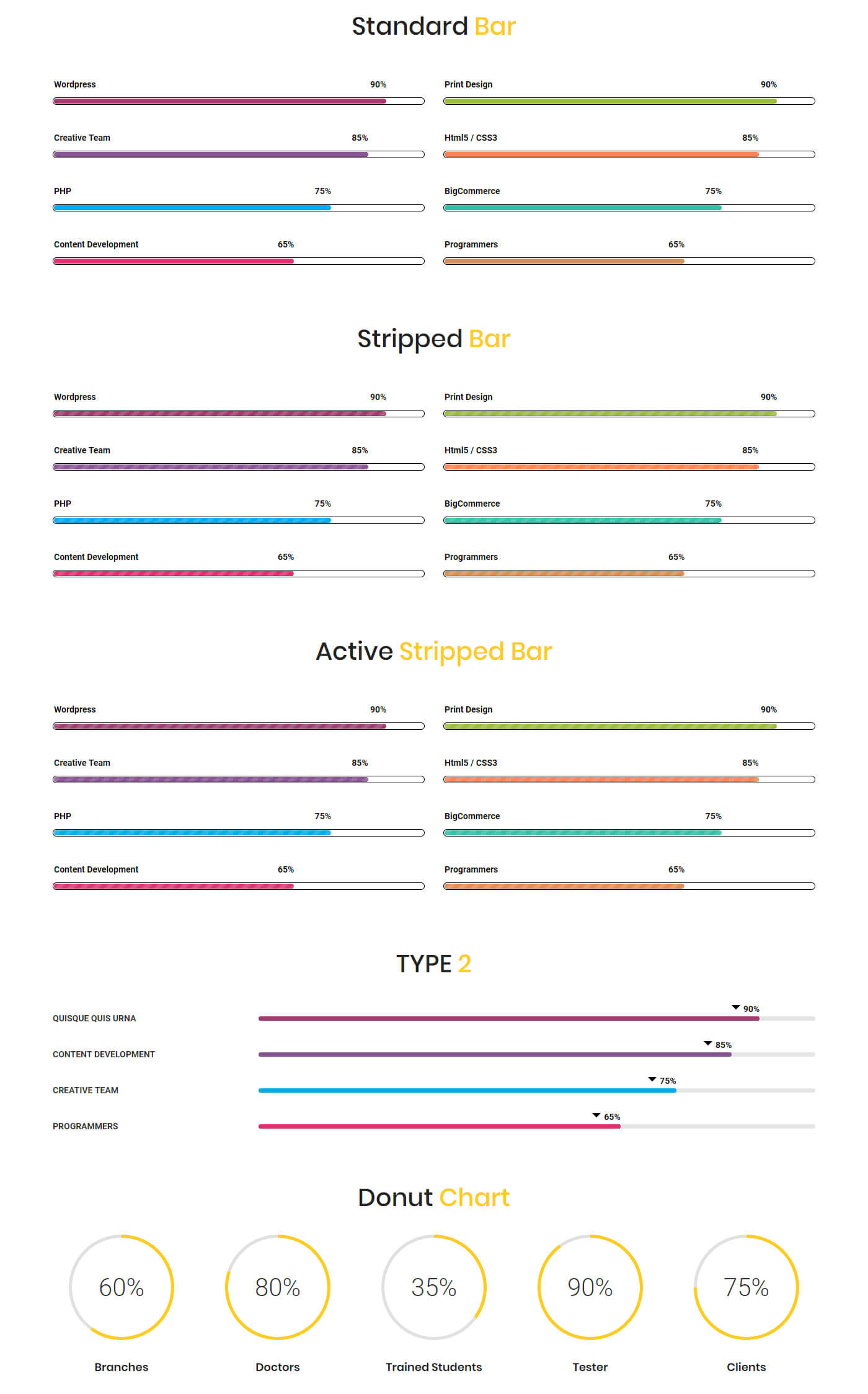
14Progress Bar
The progress bar shortcode lets you create a progress bar which helps you to show your work how far finished and to show your specialized skills with the percentage.
[vc_row][vc_column width="1/2"][dt_sc_progress_bar type="standard" text="Wordpress" value="90" color="#a33b70"][dt_sc_progress_bar type="standard" text="Creative Team" value="85" color="#8b5595"][dt_sc_progress_bar type="standard" text="PHP" value="75" color="#00adef"][dt_sc_progress_bar type="standard" text="Content Development" value="65" color="#e0316f"][/vc_column][/vc_row]
14.1Progress Bar
Available Parameters
type - The available options are standard, striped and active striped. This option let you display your progress bar in three engaging looks.
style - The available options are type1 and type2. This option let you set the style of the progress bar.
label - This option lets you add text that will be shown as the title of the progress bar.
value - This option lets you add text that will be shown as the title of the progress bar.
color - This option lets you add your preferred color for the progress.
14.2Donut Chart
The donut chart shortcode lets you create a rounded chart which helps you to show your work how far finished.
Available Parameters
label - This option lets you add text that will be shown as the title of the donut chart.
desc - This option lets you add the description for the donut chart.
size - The available options are small, medium, and large. This option let you set the size of the donut chart.
datasize - This option lets you set the value for the data of donut chart.
datapercent - This option lets you set the value for the percentage of progress should appear on the donut chart.
donutwidth - This option lets you set the width of the donut.
bgcolor - This option lets you set the background color for donut chart.
fgcolor - This option lets you set the foreground color for donut chart.
Progress Bar and Donuy Chart Output
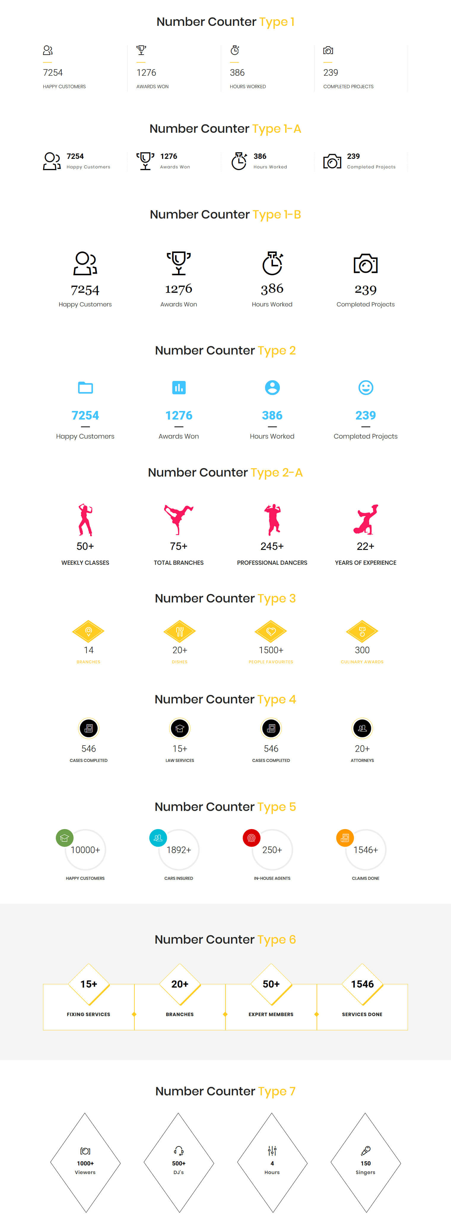
15Number Count
The number count shortcode lets you show you fun facts or stat number or animated counter number on your website.
[vc_row][vc_column][/vc_column][vc_column width="1/4"][dt_sc_number_counter icon="icon icon-users" value="7254" title="Happy Customers" class="dt-sc-university-counter aligncenter"][/vc_column][vc_column width="1/4"][dt_sc_number_counter icon="icon icon-cup" value="1276" title="Awards Won" class="dt-sc-university-counter aligncenter"][/vc_column][vc_column width="1/4"][dt_sc_number_counter icon="icon icon-timer" value="386" title="Hours Worked" class="dt-sc-university-counter aligncenter"][/vc_column][vc_column width="1/4"][dt_sc_number_counter icon="icon icon-dslrcamera" value="239" title="Completed Projects" class="dt-sc-university-counter aligncenter"][/vc_column][vc_column][/vc_column][/vc_row]
Available Parameters
type - The available options are type1, type2, type3, type4, type5, type6 and type7. This option let you display your icon box in seven attractive looks.
icon - The available options are font awesome, icon class and image. By selecting anyone from above options and you can set the icon for the timeline post. By choosing the font awesome option you can select the icon directly from the prebuilt icon library. If you choose the icon class option, you can add the icon by adding icon class name.
iconcolor - The available options are blue, brown, cadetblue, chillipepper, cyan, darkgolden, deeporange, deeppurple, green, lime, magenta, orange, pink, purple, red, skyblue, teal, turquoise, wisteria, yellow, and black. This option let you set the color for the icon. This option only available for "type5" only.
value - This option lets you add a numeric value to the icon box.
append - This option lets you add the text after numeric value.
title - This option lets you add text that will be shown as the title of the icon box.
class - Using this option you can add a custom class to the wrapping HTML element and do furthermore CSS customization on the element.
subtitle - This option lets you add the text for the subtitle. This option only available at type7.
Number Count Output
16Image Caption
The image caption shortcode lets show the images in 10 visually attractive caption looks.
[vc_row][vc_column][vc_row_inner][vc_column_inner width="1/3"][dt_sc_image_caption title="Donec Morbi fringilla eros" subtitle="Semper vel ante" image="10103" icon="icon icon-compasstool"]Lorem ipsum dolor sit amet, consectetur adipiscing elit. Morbi hendrerit elit turpis, a porttitor tellus sollicitudin at. Class aptent taciti sociosqu ad litora torquent per conubia nostra, per inceptos himenaeos. [dt_sc_br br="1"][dt_sc_button title="Read More" size="medium" style="filled"][/dt_sc_image_caption][/vc_column_inner][vc_column_inner width="1/3"][dt_sc_image_caption title="Phasellus mollis nulla" subtitle="Curabitur eget" image="10104" icon="icon icon-tools"]Lorem ipsum dolor sit amet, consectetur adipiscing elit. Morbi hendrerit elit turpis, a porttitor tellus sollicitudin at. Class aptent taciti sociosqu ad litora torquent per conubia nostra, per inceptos himenaeos. [dt_sc_br br="1"][dt_sc_button title="Read More" size="medium" style="filled"][/dt_sc_image_caption][/vc_column_inner][vc_column_inner width="1/3"][dt_sc_image_caption title="Vivamus euismod sodales" subtitle="Pellentesque lobortis" image="10105" icon="icon icon-house"]Lorem ipsum dolor sit amet, consectetur adipiscing elit. Morbi hendrerit elit turpis, a porttitor tellus sollicitudin at. Class aptent taciti sociosqu ad litora torquent per conubia nostra, per inceptos himenaeos. [dt_sc_br br="1"][dt_sc_button title="Read More" size="medium" style="filled"][/dt_sc_image_caption][/vc_column_inner][/vc_row_inner][/vc_column][/vc_row]
16.1Image Caption
Available Parameters
type - The available options are type1, type2, type3, type4, type5, type6, type 7, type8, type9 and type 10.This option let you display your images in 10 varinat eye-catching looks.
title - This option let you add text that will be shown as the title of the image post.
title_link - The title link option lets you add a link and title caption for the title.
subtitle - This option lets you add the text for the subtitle. This option only available at type1, type2, type3, type4, type5, type6, type 7, type8, and type9.
image - This option let you add an image for the image post.
imgpos - The available options are default and below content. This option lets you set the image below the content.
icon - The available options are icon class and image. By selecting anyone from the above options and you can set the icon for the image post. By choosing the icon class option, you can add the icon by adding icon class name. If you choose the image option, you can directly add the image icon from your media library. As well, you can also add image hover text by using image hover text option.
content - The content option lets you add the description for the image post.
class - Using this option you can add a custom class to the wrapping HTML element and do furthermore CSS customization on the element.
overlay - This option let you set overlay background color. This option only available at type10.
16.2Image Flip
Available Parameters
image 1 and image 2 - These options let you add images to the flip box.
link - The title link option lets you add a link and title caption for the title.
Image Caption Output

17Toggles
The toggle shortcode lets you create to hidden parts on the page content to give a short look to the article and enable users to click to see more information in a single page.
[vc_row][vc_column width="1/2"][dt_sc_toggle_group][dt_sc_toggle title="Toggle 1"]Lorem ipsum dolor sit amet, consectetur adipiscing elit. Morbi hendrerit elit turpis, a porttitor tellus sollicitudin at. Class aptent taciti sociosqu ad litora torquent per conubia nostra, per inceptos himenaeos.[/dt_sc_toggle][dt_sc_toggle title="Toggle 2"]Lorem ipsum dolor sit amet, consectetur adipiscing elit. Morbi hendrerit elit turpis, a porttitor tellus sollicitudin at. Class aptent taciti sociosqu ad litora torquent per conubia nostra, per inceptos himenaeos.[/dt_sc_toggle][dt_sc_toggle title="Toggle 3"]Lorem ipsum dolor sit amet, consectetur adipiscing elit. Morbi hendrerit elit turpis, a porttitor tellus sollicitudin at. Class aptent taciti sociosqu ad litora torquent per conubia nostra, per inceptos himenaeos.[/dt_sc_toggle][dt_sc_toggle title="Toggle 4"]Lorem ipsum dolor sit amet, consectetur adipiscing elit. Morbi hendrerit elit turpis, a porttitor tellus sollicitudin at. Class aptent taciti sociosqu ad litora torquent per conubia nostra, per inceptos himenaeos.[/dt_sc_toggle][/dt_sc_toggle_group][/vc_column][vc_column width="1/2"][/vc_column][/vc_row]
17.1Toggles
Available Parameters
style - The available options are default and frame. This option let you set a likable design for your toggles section.
type - The available options are type1 and type2. This option let you display your toggles in engaging looks. This option only available at frame style.
class - Using this option you can add a custom class to the wrapping HTML element and do furthermore CSS customization on the element.
17.2Toggle
Available Parameters
title - This options let you add title for the toggle.
content - The content option lets you add the content to the toggle.
Toggle Output

18Accorcion
The accordion shortcode allows you to create a segment which forms content within collapsable items. Notably, the accordion allows showing only one collapsed item at the same time. As well, the accordions can toggle through a plenty of text blocks with a single click.
[vc_row][vc_column width="1/2"][dt_sc_accordion][dt_sc_accordion_tab title="Accordion 1"][vc_column_text css=".vc_custom_1451047195862{margin-bottom: 0px !important;}"]Lorem ipsum dolor sit amet, consectetur adipiscing elit. Morbi hendrerit elit turpis, a porttitor tellus sollicitudin at. Class aptent taciti sociosqu ad litora torquent per conubia nostra, per inceptos himenaeos.[/vc_column_text][/dt_sc_accordion_tab][dt_sc_accordion_tab title="Accordion 2"][vc_column_text css=".vc_custom_1451047195862{margin-bottom: 0px !important;}"]Lorem ipsum dolor sit amet, consectetur adipiscing elit. Morbi hendrerit elit turpis, a porttitor tellus sollicitudin at. Class aptent taciti sociosqu ad litora torquent per conubia nostra, per inceptos himenaeos.[/vc_column_text][/dt_sc_accordion_tab][dt_sc_accordion_tab title="Accordion 3"][vc_column_text css=".vc_custom_1451047195862{margin-bottom: 0px !important;}"]Lorem ipsum dolor sit amet, consectetur adipiscing elit. Morbi hendrerit elit turpis, a porttitor tellus sollicitudin at. Class aptent taciti sociosqu ad litora torquent per conubia nostra, per inceptos himenaeos.[/vc_column_text][/dt_sc_accordion_tab][dt_sc_accordion_tab title="Accordion 4"][vc_column_text css=".vc_custom_1451047195862{margin-bottom: 0px !important;}"]Lorem ipsum dolor sit amet, consectetur adipiscing elit. Morbi hendrerit elit turpis, a porttitor tellus sollicitudin at. Class aptent taciti sociosqu ad litora torquent per conubia nostra, per inceptos himenaeos.[/vc_column_text][/dt_sc_accordion_tab][/dt_sc_accordion][/vc_column][/vc_row]
Available Parameters
style - The available options are default and frame. This option let you set a likable design for your accordion section.
type - The available options on default style are type1 and type2. The available options on frame style are type1, type2 and type3. These options let you display your accordion in engaging looks.
class - Using this option you can add a custom class to the wrapping HTML element and do furthermore CSS customization on the element.
Accordion Output

19Testimonial
Our testimonial shortcodes enable you to create a wonderful feedback section for share you clients feedbacks.
[vc_row][vc_column][dt_sc_testimonial image="10187" name="Catherine" role="CEO"]Curabitur consequat felis ipsum, ac ultrices mauris varius vel. Proin vel felis ultrices, maximus dolor sit [dt_sc_br br="1"] amet, vehicula neque. Vivamus sed arcu sit amet eros suscipit rutrum hendrerit in diam.[/dt_sc_testimonial][/vc_column][/vc_row]
Available Parameters
type - The available options are type1, type2, type3, type4, type5, type6, type 7, and type8. This option let you present your clients feedback in 8 different looks.
image - This option let you add the image of your client told the feedback.
name - The name option lets you define the name of the client told the feedback.
role - The role option lets you define the role of the client told the feedback.
content - The content option lets you add the feedback told by the client.
class - Using this option you can add a custom class to the wrapping HTML element and do furthermore CSS customization on the element.
Testimonail Output

20Pricing Box
The pricing box shortcodes let you create highly catchy pricing table to showcase your best pricing and offers details to the viewers.
[vc_row][vc_column width="1/3"][dt_sc_pricing_table_item highlight="yes" heading="Heading" subtitle="Best price for a basic site" currency="$" price="11" decimal=".99" permonth="/ Month" link="url:%23|title:Signup%20Now|"]
- List Item 1
- List Item 2
- List Item 3
- List Item 4
[/dt_sc_pricing_table_item][/vc_column][/vc_row]
20.1Pricing Box 1
Available Parameters
heading - This option let you add text that will be shown as the title of the pricing box.
subtitle - This option lets you add the text for the subtitle.
is active - The available options is yes. If you select this option the pricing box will be highlighted when you hover the pricing table.
thumb - The image option lets you add the image for the pricing table.
currency - This option lets you set the symbol of the currency.
price - The price option lets you set the price for the pricing table.
permonth - The price unit option lets you set the unit for the pricing.
type - The available options are standard and classic. This option let you display your pricing table in two variant engaging looks.
content -The content option lets you add a short description for the pricing table.
link - The url option lets you add a link and title caption for the title.
20.2Pricing Box 2
Available Parameters
heading - This option let you add text that will be shown as the title of the pricing box.
subtitle - This option lets you add the text for the subtitle.
icon - The available options are font awesome and icon class. By selecting anyone from the above options and you can set the icon for the pricing table. By choosing the font awesome option you can select the icon directly from the prebuilt icon library. If you choose the icon class option, you can add the icon by adding icon class name.
starting - This option lets you add the text before the price.
price - The price option lets you set the price for the pricing table.
permonth - The price unit option lets you set the unit for the pricing.
link - The url option lets you add a link and title caption for the title.
20.3Pricing Box 3
Available Parameters
number - This option lets you add the numerical value for showing the plan period.
currency - This option lets you set the symbol of the currency.
price - The price option lets you set the price for the pricing table.
month - The price unit option lets you set the unit for the pricing.
plan - This option let you describe the plan validated for a week, month and year.
content - The content option lets you add a short description for the pricing table.
is active - The available options is yes. If you select the option the pricing box will be highlighted when you hover the pricing table.
link - The url option lets you add a link and title caption for the title.
Pricing Box Output

21Portfolio
The Portfolio shortcode let you create a responsive portfolio with multiple columns and filters for showcasing your best works.
[vc_row][vc_column][dt_sc_portfolios column="2" style="type5" allow_filter="no" count="2"][/vc_column][/vc_row]
Available Parameters
count - This option let you set the number of posts to be displayed on the page.
columns - The available options are 2, 3, and 4 columns. This option let you set the number of columns for displaying the posts.
style - The available options are modern title, title & icons overlay, title overlay, icons only, classic, minimal icons, presentation, girly,and art. This option let you set an engaging design for your portfolio items.
allow_gridspace - The available options are yes and no. If you select the option yes the portfolio items will be shown in grid look. If you select the no the portfolio items will be shown in the attached look.
allow_filter - The available options are yes and no. This option let you enable or disable the filters on the page.
terms - This option let you display your preferred category posts only on the page.
Portfolio Output

22Recent Post
The recent posts shortcode let you create a responsive blog section with author, date, category, and tags in multiple columns to show your expertise. Also, it provides the best way to drive traffic to your websites with dynamic content.
[vc_row][vc_column][dt_sc_recent_post column="one-half-column" excerpt_length="30" count="2"][dt_sc_button size="small" iconclass="fa fa-long-arrow-right" iconalign="icon-right with-icon" style="filled" class="transparent" title="Read More" icon_type="fontawesome" target="_blank" /][/dt_sc_recent_post][/vc_column][/vc_row]
Available Parameters
count - This option let you set the number of posts to be displayed on the page.
columns - The available options are I Column, II Columns, III Columns, I-II-II Columns, I-III-III Columns, I-II-I-II Columns, and I-III-I-III Columns. This option let you set the number of columns for displaying the posts.
style - The available options are default, date left, date left modern, date and author left, modern, bordered, classic, trendy, overlap, stripe, fashion, minimal bordered, medium, medium highlight, and medium skin highlight. This option let you set the blog in attractive looks.
allow_excerpt - This option let you display a description with your preferred length about the post content.
excerpt_length - This option let you set the number of words need to be displayed from the excerpt content.
show_post_format - The available options are yes and no. This option let you show and hide the format of the post.
show_author - The available options are yes and no. This option let you show and hide the author name of the post.
show_date - The available options are yes and no. This option let you show and hide the published date of the post.
show_comment - The available options are yes and no.This option let you show and hide the comment of the post.
show_category - The available options are yes and no.This option let you show and hide the category of the post.
show_tag - The available options are yes and no.This option let you show and hide the tags of the post.
read more button - This option let you add the button for the post.
Recent Post Output
